You know how you open a dialog to ask for confirmation or additional information, or to warn them what’s about to happen? Yeah. People don’t read that stuff. The dialogbox is just an obstacle to completing their task. They may press Enter or do whatever it takes to get past it — especially if they routinely encounter other dialogs in the application.
This article discusses best practices and tooling to get people’s attention where it’s needed and to avoid negative consequences of inattention.
Make the default choice non-destructive

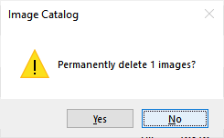
When asking the user for confirmation whether to take some action, have the default selection be the one that doesn’t cause data loss.
LotusScript’s Messagebox function lets you select which button is the default selection, if the user just presses Space or Enter. Use the MB_DEFBUTTON constants for this.
ans = MessageBox(zstr1(MSG_DELETE_CONFIRM, cImages), MB_ICONEXCLAMATION + MB_YESNO + MB_DEFBUTTON2, DLGTITLE)
Offer a Cancel option where possible, to get out without taking any action.
Use a Trash folder
Like your mail file, any application can have a Trash folder where documents can be placed for eventual deletion. How to do this has been documented elsewhere; I just want to remind you to consider whether it makes sense for your application.
Getting fancy
I’ve attached a sample database here, also available on the Downloads page, with reusable code and other design elements (a script library, some subforms, and some image resources). This code supports fancier dialog boxes with features designed to capture users’ attention and get them to think about questions. The capabilities include:
- Specifying a list of possible options.
- Insisting on an answer with there being no default response — the user can’t just press Enter — they must first select something, then click OK (or Enter).
- Ability to disable Cancel in the dialog, forcing a choice among the available options.
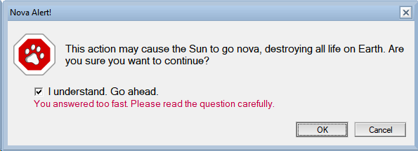
- Ability to show eye-catching icons for info, stop, warning, and question.
- Ability to set a timer so no answer will be accepted before the timer expires. This prevents accidental and thoughtless responses, forcing the user to take time to read and consider the question before answering.
This screenshot shows the latter two features.

All these options are supported through a single class method call, as follows:
Function DialogChoice(ByVal style%, ByVal prompt$, ByVal icon$, ByVal title$, choices, defaults, ByVal options%, ByVal pause As Single) As Variant
where the arguments are:
- style: Preferred style of selection list, where choices are:
- DLGSTYLE_LIST: a listbox. If there are more than 30 choices, a listbox is always used.
- DLGSTYLE_CHECK or DLGSTYLE_RADIO: use checkboxes or radio buttons, depending on the value of the multiple selection option below. These symbols have the same value. The different names let the caller signal their intention to people reading the code.
- DLGSTYLE_AUTO: (= 0) Choose what style to used based on the number of choices and the multiple-choice setting.
- prompt: question to display in the dialog.
- icon: “”, or name of image resource to display as an icon beside the prompt.
- title: dialogbox title
- choices: string array of choices, optionally using “|” to delimit a keyword synonym, e.g. Split(“Yes|1,No|0”, “,”)
- defaults: array or scalar containing default values for selection. If keyword synonyms are used, use only the value part of the choices, e.g. “1”.
- options: sum of whichever of the following options you want to enable:
- DLGOPT_NOCANCEL = 1: Don’t display a Cancel button in the dialog and don’t let the user close it in any other way except by selecting an answer.
- DLGOPT_REQUIRED = 2: If the user doesn’t cancel the dialog, they must select a non-blank answer.
- DLGOPT_NOSYNONYM = 4: Don’t allow keyword synonyms — treat “|” as regular character rather than a delimiter between keyword and value.
- DLGOPT_MULTIPLE = 8: Allow multiple selection. This will force use of either a checkbox or a listbox with multiple selection turned on, as opposed to a radio button. If there’s only one choice, the multiple selection mode is always used (paradoxically) because this lets the user deselect the one selection, which isn’t possible with a radio button.
- pause: the number of seconds that must elapse before we let the user click OK. They can cancel immediately, however, if cancel is allowed.
The return value is either EMPTY if the user canceled, or an array containing the selections. An array is used even in the single-selection mode. If no selections were checked, the one element of the array contains “” (empty string).
Usage notes
This is a versatile function, usable in a lot of different situations. You may want to have functions with fewer arguments to implement some of the most common ones, by calling this one, such as the single-choice confirmation checkbox above.
Often you can get by with the NotesUIWorkspace.Prompt method instead of using this fancy code. The shortcomings of Prompt that I wanted to address with this project are:
- No icon.
- Too-small fonts.
- No ability to distinguish between the user pressing Cancel, and the user clicking OK without selecting anything.
- No way to block Cancel.
Take care with the “No cancel” option, and especially think hard about using it in situations where there’s only one choice available, so the user is just forced to perform an action without actually giving them a choice. It generally makes sense to prohibit cancel only in cases where it’s no longer possible to exit and take no action because something has already happened, and you need the user to tell you what to do about it.
Implementation notes
In this sample application, the function is implemented as a method in the UICommon class, in the script library UICommon. I’ve used this library in other applications, including CompareDBs, but in this case I’ve only included this one method. It’s probably best to merge this code with whatever library you use, rather than keeping it separate. It doesn’t have to be a class method, but if it’s not, you’ll need to adjust the code to come up with its own NotesUIWorkspace object rather than relying on the one the class provides.
The function code assumes the presence of four subforms corresponding to the four styles of choice field the dialog might display — radio, checkbox, single select list, and multi select list. Each of these subforms contains two selection fields, one supporting keyword synonyms and the other not. The one that’s not in use at the time, is hidden.
I wanted to have my own OK and Cancel buttons on the subforms, and hide the ones Dialogbox provides by default. This was so I could have a disabled OK button that would become enabled once the requirement to select an answer had been met. However, I couldn’t get buttons in the dialogbox to work reliably — I was forced to use the default buttons.
My limit of 30 items for a checklist or radio UI was based on testing on my own screen to see what would be too long to reasonably fit. It may not be conservative enough, given the wide variety of displays out there.
The sample application contains four image resources for use as icons (or you can use your own). Mine are similar to those the Messagebox statement can display.
The code to validate that required answers are given and to prevent Cancel, is the Queryclose event of the subforms. You can explore the code on your own, but I wanted to mention here that I’ve found the Source argument to the Queryclose event is unreliable — due to a client bug, sometimes it doesn’t have information about the current document. I have the Postopen event store the NotesUIDocument object it is passed as a global variable, for use during Queryclose.
If you find this website helpful and want to give back, may I suggest buying, reading, and reviewing one of my excellent books? More are coming soon!
If you want email whenever there’s a new post, you can subscribe to the email list, which is 100% private and used only to send you information about stuff on this site.
Don’t ask me again
A way to prevent users accidentally giving wrong answers, is to offer them to not be asked a question in future. They can record their answer in advance, in cases where it will always be the same.

In this example, if the user is certain they will never want to “de-bog” any documents (whatever that means) they can say this. It’s a time-saver for them, and reduces the chance of error by not giving them a chance to answer incorrectly in the future. It also potentially helps performance since if the answer is “never”, you probably don’t even need to check for bognabbed documents in the view Postopen event.
I’m using the above dialog function to ask the question, but if they say “Don’t ask again”, where do you record the answer so you’ll know not to ask again? This is a good application for a personal profile document. Don’t forget to offer a personal preference editing function so they can restore bognab checking and undo other “don’t ask” decisions, if necessary.
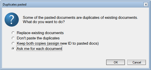
Answer for all or ask me for each

Another way to prevent erroneous answers is to not ask unnecessary questions. Users get burnt out on repetition and that’s why they’re not reading the question. If you can easily get users to select the principle they would use to answer the question, you can write code to apply that principle and not have to ask them separately each time a decision needs to be made.
In the above example, the principle we’re offering them to choose is really simple — “same answer in each case”. It’s helpful if you can offer more flexibility to automate common decision rules. In this case, you might also give an option to “keep the more recent copy,” assuming you have a straightforward way to decide which one that is.
Users don’t want to have to write a program to automate their question-answering, but if you can interview some of them during development to investigate their use cases, you can probably either come up with a small set of pre-coded rules to offer, or even just not have to ask the question at all, but handle it in what everyone agrees is the One Right Way.
